No products in the cart.
Design Strategy
How to demonstrate design’s value and measure its ROI
01
Apr
Apr
Great design leads to great products, and great products lead to business success. Pretty straightforward, right? Especially from a designer’s point of view.
However, when an executive asks us “What’s the value of this feature you want to implement?” or “What’s the ROI (Return on Investment) of that design system?”, we may find ourselves in a bit of a fluster.
The problem: “You can’t manage what you don’t measure.”
A lot of decision makers live by this statement, which was first made by Peter Drucker.
Usually, designers can post-rationalize design ROI and some cold hard numbers, but they aren’t at the forefront of our minds when we’re faced with a problem. They do, however, make it much easier to gain executive buy-in and obtain the resources we so need.
That’s why we’re going to look at which important KPIs (Key Performance Indicators) you should measure and the different ways in which you can showcase the value of design and ROI.
Let’s see how we can champion our discipline, establish its value, build trust with executives, win resources and convince them to make the right quality-over-speed tradeoffs.
![]()
What should you measure and how do you do it?
As you’ll soon see, there are a number of metrics that show the impact of design and various design elements. Some metrics are design specific, while others are more holistic, where design is not the only variable but still plays a huge role.
Your first task is to decide what to measure.
In order to make the right choice, you must review existing business drivers and KPIs. That way, you’ll be able to align your design metrics with organizational goals. This is absolutely crucial if you want to show just how much design can benefit your company.
After this, it’s time to set some KPIs yourself in order to track your progress and showcase the value of design for your business. We’ll talk about possible KPIs shortly.
Once you’ve narrowed down what you want to measure, you should put your KPIs through the SMART model to create objectives that your team will strive to achieve.
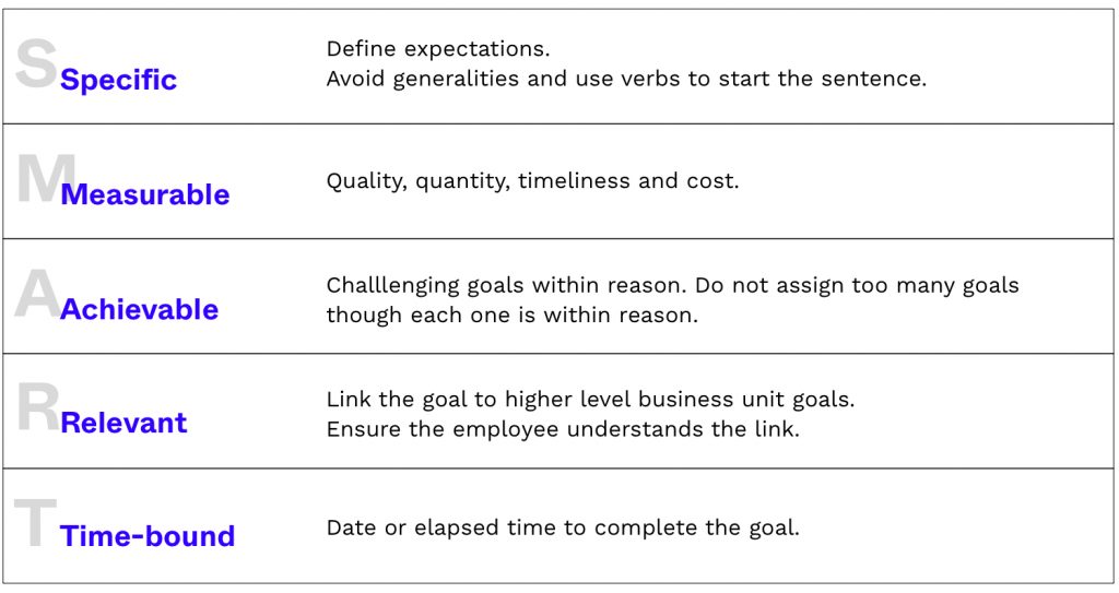
Here’s an example of a strong SMART goal:
We want to increase the number of daily active users by X% in the next X months.
Now that you’ve outlined your goals, you can decide which features or content you require in order to reach them.
For example, this particular goal requires us to check funnel drop-offs. Based on the results, you might need to change login screens, increase user engagement on the homepage, provide more value for the users or do something else entirely depending on your industry.
Here are a few industry-specific examples for goals:
- Analytics dashboard
Personalize the dashboard view (simplify, add or remove features). - Ecommerce apps
What’s the added value compared to your basic website? Are people using your “special” features (such as geolocation, wishlist, etc.). Do you have an overview of product variations or options (such as color and size)? Do you have visible trust factors (such as a money-back guarantee)? - Fintech
Is your user-flow clear to your users? Do they know how to send money or change its currency?
You can then estimate what it’s going to take to reach the goal, as well as the ROI once you’ve achieved it. This is a good general approach to follow.
3 most valuable categories and specific metrics
We’ll now explore some specific metrics that will help you to prove the importance of design in various ways. I’ve divided them into three main categories, but you’ll notice that they sometimes overlap (as most things do in business).
![]()
Time
When creating anything, companies always aim to save time without cutting too many corners. They also look to “get” time from users by keeping them engaged and encouraging interaction with their product. This provides you with different ways to measure time and show how design can affect it.
![]()
Increase user engagement time
User engagement time generally tells you how interesting your content is to an average user. It also indicates how simple your site or app is to navigate, as people tend to abandon frustrating user experiences far more quickly.
With that said, this metric can be vital for some industries. Games, news sites and various apps depend on their users actually spending time interacting with their content.
Design can impact engagement time in a variety of ways – smoother user flow, navigation, presentation of content, and more. It can be a valid KPI to measure, especially as it’s also connected to user loyalty and their LTV (Lifetime Value).
![]()
Save time and improve efficiency
Saving time means saving money, which is why this metric can be extremely influential when seeking internal buy-in or executive approval.
Imagine you want to implement a design system in order to make your design department more efficient and consistent. This may seem like a mammoth task, one that has no immediate impact for some decision makers.
The best way to go about it is to clearly demonstrate the system’s value. Keep in mind that we are talking about an existing business here; if you’re starting from scratch, the process is different.
- Estimate how long it takes the design team to complete a typical project, all the way from the wireframes.
- Estimate how much faster a project could be completed if the designers had a design system in place.
- Look at efficiency gains for the engineering or development teams, who would be able to assemble pre-built pieces.
- Look at quality assurance savings from an estimated reduction in bugs and defects.
- Translate time savings into cost savings.
- Estimate the impact on speed of delivery and time to market.
These numbers will make it much easier to understand why a design system is worth implementing. Once you have estimated the cost of establishing and maintaining such a system, you can compare it to the estimated savings in order to get your ROI numbers.
An additional step you might take is to calculate the time you are losing right now.
Do a design audit, find all of the different iterations of the same button or some other element that you’re using, calculate how much time is needed to design and code a single iteration of it, and voila! You’ll soon have another persuasive number up your sleeve.
Saved and lost time are two metrics that can also be used for anything relating to automation and smoother UX processes. If you want to design a bot that lowers the volume of support calls, that’s your go-to metric.
![]()
Below is a list of some time-related metrics that can be used as KPIs and connected to design ROI:
- Time for task completion
- Time spent waiting for support
- Time saved per day or project
- Time lost per day or project
- Average session duration
- User engagement time
![]()
Satisfaction
Measuring user satisfaction (and everything connected to it) is a pretty big deal, as it will transform the “we want to make our users happy” into a much stronger and more tangible argument.
The two main metrics here are CSAT (Customer Satisfaction) and NPS (Net Promoter Score).
CSAT usually measures satisfaction by asking a question like “How satisfied were you with the product/service?” and providing a scale from 1 to 10. It’s a simple and direct rating.
NPS measures the potential of word-of-mouth recommendations and loyalty with a question such as “How likely are you to recommend our product/service to your friends and colleagues?”. Again, a scale of 1 to 10 is used. It’s connected to CSAT as satisfied users are more likely to recommend your service to their friends.
However, CSAT and NPS are not very strong KPIs by themselves. You must first prove their value. You need to show the difference between a user that gave your business a 7 and a user that gave you a 9, and there are various ways to do this.
One way is to measure CLV (Customer Lifetime Value) and then see if CSAT affects the results.
The simplest formula for measuring CLV is:
The average order x
The average number of purchases in a year x
The average retention time in years
= CLV
You can now segment users into various “satisfaction groups” with the help of your CRM software (or kindly ask your marketing department to do it). Compare the CLV of different groups and you’ll quickly see whether higher CSAT translates to higher LTV. If it does, increasing CSAT would be a worthwhile goal.
If user engagement time is one of your main KPIs, you can analyze whether it increases alongside CSAT. Same thing with retention – do the number of visits and the time someone spends using your product increase together with CSAT?
There are quite a few correlations you can look for in order to prove that enhancing your user flow, and therefore improving your CSAT, makes business sense.
Another strong metric you can implement is the number of referrals compared to NPS. After you’ve measured NPS, you can offer users a referral code or link to share with their friends – like AirBnB or Uber or Booking.com. You’ll quickly discover the NPS rating when users start spreading the word about your product or service. Is your average NPS below it? Here’s a great reason why you should improve it through design.
These are some of the ways that you can tie your design to user satisfaction and ROI. Now, let’s check out a framework that will make this task a bit easier.
HEART framework
The HEART framework is a set of user-centered metrics which clearly defines satisfaction levels while using a product. It was developed by Google to evaluate the quality of the user experience and help teams measure the impact of UX changes.
I strongly suggest you give it a try and see if it works for you.
Here’s a list of some user satisfaction metrics that can be used as KPIs and connected to design ROI:
- CSAT
- NPS
- User return rate within a specific timeframe
- Average time to 2nd session
- Average time between sessions
- Average number of user sessions per week
- User sign-ups
- Churn
- Percentage of active users
- User retention
- Daily active users (DAU)
- Monthly active users (MAU)
- Daily app launches
![]()
Revenue
In addition to metrics that will eventually lead to saving or making money, there are also some that are directly connected to a company’s revenue.
It goes without saying that design decisions can impact conversion rates, acquisition of new customers, average purchase value and more.
But how do you demonstrate the value of the improvements that you want to make?
- Find similar case studies. It’s possible that another business has done something similar. If you think that you’re missing out on upsell opportunities because you aren’t recommending relevant products at the checkout page, you can find out how this change has impacted another e-commerce store. That’s your starting point.
- Estimate. Research the industry averages and standards for your chosen KPIs. Combine these with your case study findings. Now you can estimate how this change will affect your chosen metric.
- Suggest an A/B test or a pilot project. If you don’t have definite numbers to win over your executives, you can always start small(er). If your initial experiment proves successful, you’ll have strong leverage to implement the desired change on a larger scale.
You can set up a live dashboard so that you have a clickable and interactive example of the impact you’re expecting. This makes it easier to demonstrate exactly what will change and how it will affect the revenue.
The list below includes some revenue-related metrics that can be used as KPIs and connected to design ROI:
- Conversion rate
- Average purchase value
- Number of new customers
- Acquisition cost
- LTV
(Live) funnel method subhead
As you can see, there are plenty of metrics that you can use to showcase the value of design.
The next step is bringing it all together and presenting the measurements and their impact.
You can do this in many different ways, but one of the methods is to use live funnel maps created with a tool like Geru (especially for mobile and web applications).
You can also use Sketch and create something like the two examples below:
Web application or a website flow:

Mobile application example:

Showing live metrics, their influence on the funnel and the overall bigger picture will help designers and other departments to visualize what’s going on.
It’s far easier to spot opportunities that will bring the highest ROI and to show how the improvement of a certain feature will impact the whole funnel.
If you decide to give funnel maps a try, I suggest you do it like this:
- Map out your entire flow with screenshots. You’ll get a clear picture of whether it is consistent from a design point of view. Often, it’s not. (check the two examples above)
- Record your funnel. Save each video with a time-stamp. This will make it easy to refer back to certain parts of it and see how something looked before the changes were implemented.
- Write down the architecture diagram. Create a text-only version in Excel.
- Start measuring your desired KPIs with whatever software you like the most.
- Import the metrics to Excel, then observe and add notes from a UX perspective. You won’t get results overnight – the time needed to obtain relevant data depends on the number of your customers.
- Create goals based on the results. Make a plan and start changing the flow.
Document all changes and don’t forget to add your notes. They will help you to understand the decision making process when you look back over them in a few months’ time. - Observe the impact, measure ROI, make more changes when necessary and continuously improve.
Besides the metrics that we’ve already covered in this article, here are some others that can also be effective when using this method:
- Success and failure rate
- Average screens per session
- Screens with the longest and shortest visit duration
- Screens with most user interactions
- Screens with the highest quit rate
- Number of usability problems fixed
- Cost to perform usability activities
![]()
Before you head off to crunch some numbers, I just want to re-emphasize one point from this article.
Always make sure that your KPIs are aligned with your company’s business goals.
It makes a lot of things so much easier.
Now, go and show why design matters! 😉
About the author

Oh hey, I’m Romina Kavcic, Design strategist
I am a Design Strategist who holds a Master of Business Administration. I have 14+ years of career experience in design work and consulting across both tech startups and several marquee tech unicorns such as Stellar.org, Outfit7, Databox, Xamarin, Chipolo, Singularity.NET, etc. I currently advise, coach and consult with companies on design strategy & management, visual design and user experience. My work has been published on Forbes, Hackernoon, Blockgeeks, Newsbtc, Bizjournals, and featured on Apple iTunes Store.
More about me * Let’s connect on Linkedin * Let’s connect on Twitter
Comments
Romina Kavčič
Explore more
